Styling Improvements
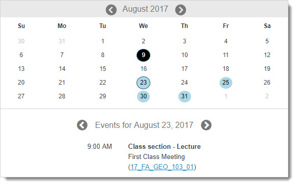
Calendar Widget
Did you know that students think the Calendar tool is the third most important tool in Isidore? Because of the high usage of this tool, we improved the look and feel of the interface of the Calendar widget that appears on the Overview pages within course sites as well as on users' Isidore Home pages.
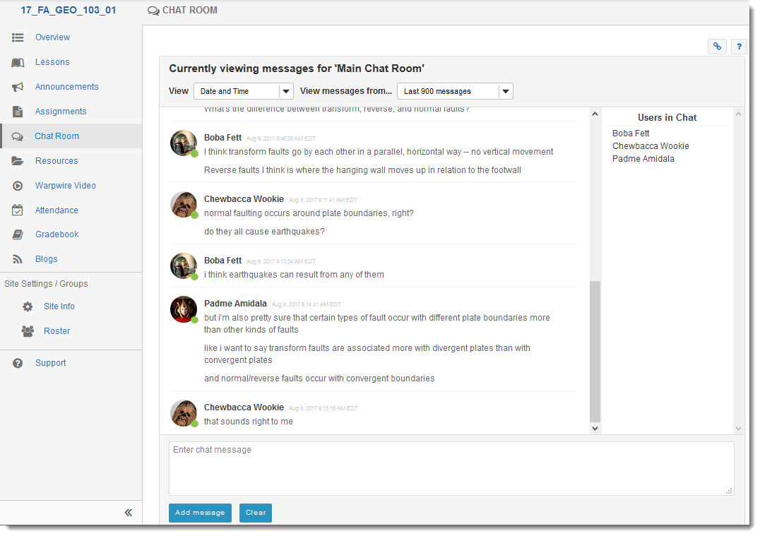
Chat Interface
We are betting most of you have not used the Chat tool in years. Encourage your students to collaborate with each other synchronously with the improved Chat tool.
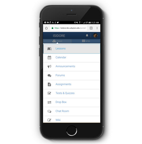
Mobile Tool Menu
From May 2013 to April 2015, mobile logins to Isidore increased from 13% to 17%. We expect the amount of mobile usage to continue this climbing trend, so we redesigned the mobile tool menu to be more responsive and easier to use on phones, tablets, and smaller screens.
Persisting Navigation Bars
To help you navigate around Isidore more quickly, the navigation bar (or breadcrumbs bar, to the fairy-tale inclined) now sticks to the top of the page as you scroll down in Isidore. This can be useful for jumping to the overview page of your site or to the main page of whatever tool you are using. The button to expand and collapse the tool menu also sticks with you as scroll down so you can maximize your screen space at any time.
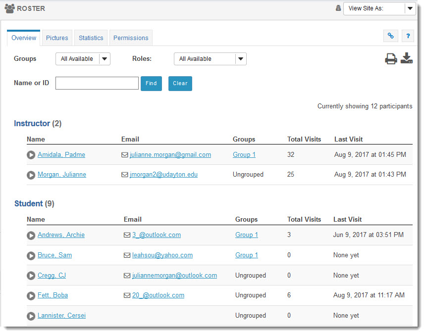
Roster Table
The Roster tool has long looked a bit dated. We made a few small adjustments to the styling of the Roster table to make it more modern and minimal while still preserving all of the valuable information it displays.